Other links
- About us
- BlogsNEW
- Contact us
- CareersCOMING SOON
Industry
Services
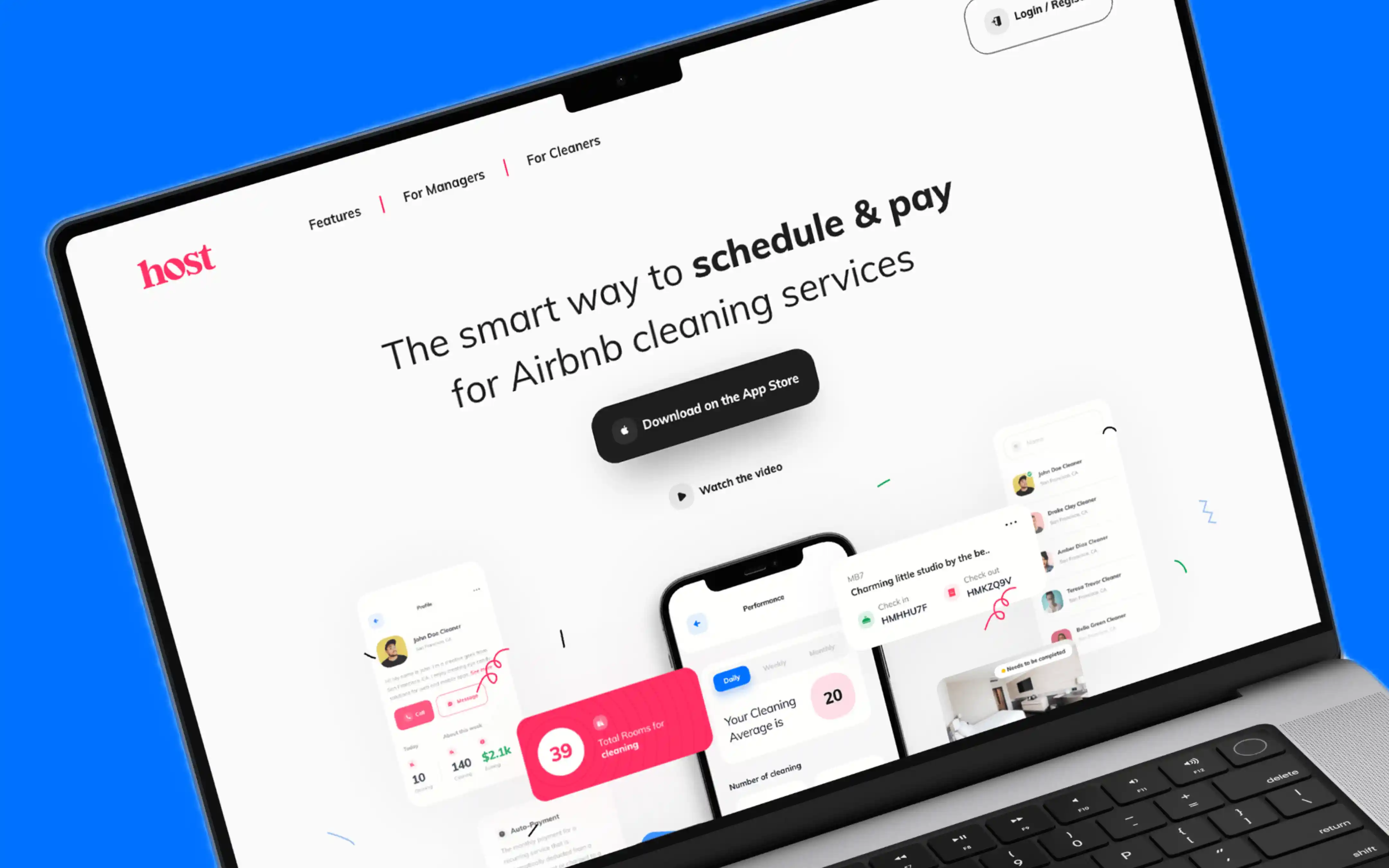
Host is an essential vacation rental tool, crafted by hosts for hosts. Simplifying scheduling, communication, and instant payments. The goal is to transform the company's digital presence by revamping both the UI/UX and branding. We aim to create a cohesive and visually appealing experience that reflects the brand values, increases user engagement, and boosts brand recognition.
Our challenge ensuring a consistent and smooth user experience throughout the entire user journey, from booking management to staff communication to payment, can be challenging, especially when integrating multiple features seamlessly. Designing a UI/UX that can scale as 'Host' grows in terms of users and features without sacrificing performance and usability is a long-term challenge. The vacation rental management tool market is competitive, with established players. 'Host' must find a unique selling proposition and create a UI/UX that stands out in a crowded field.
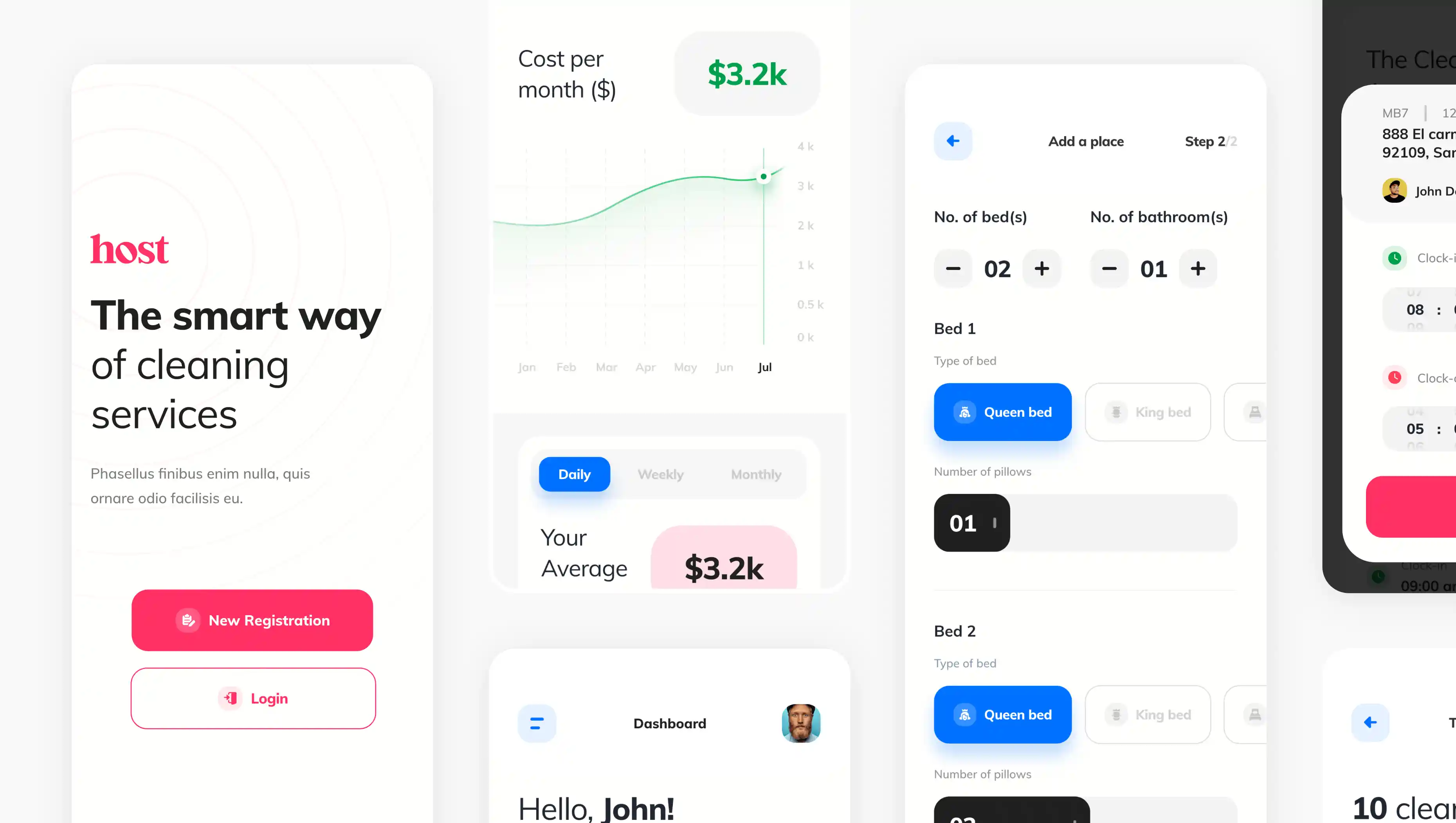
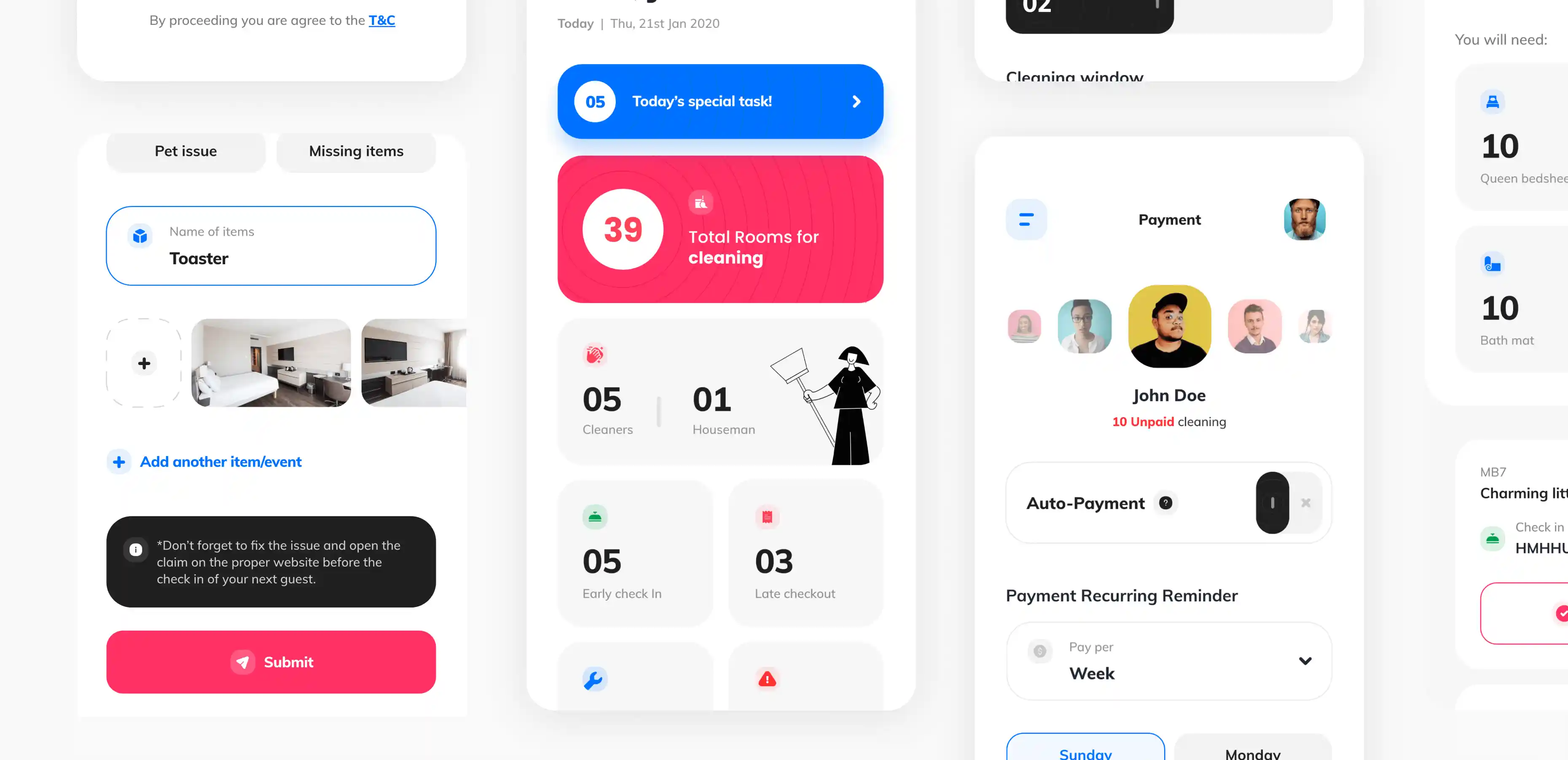
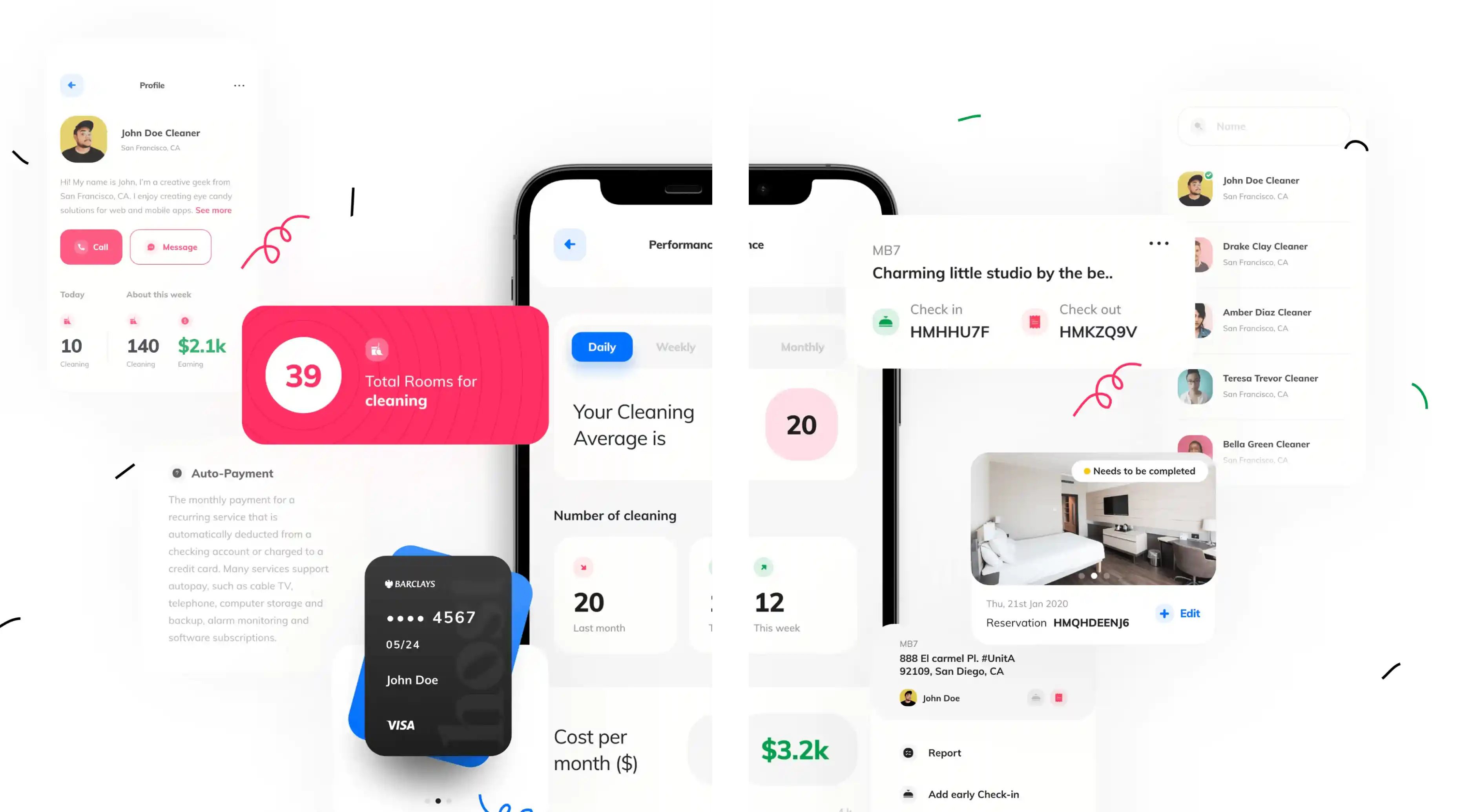
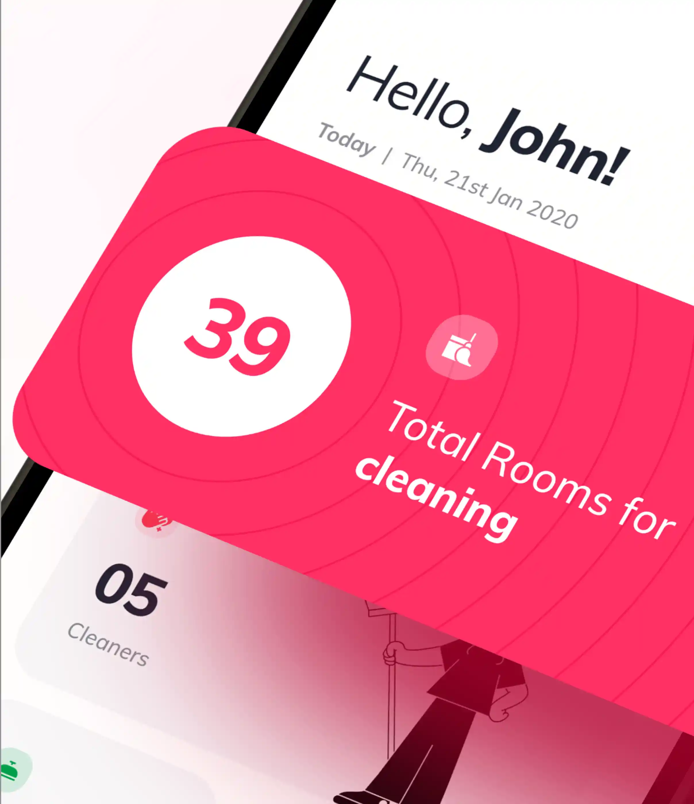
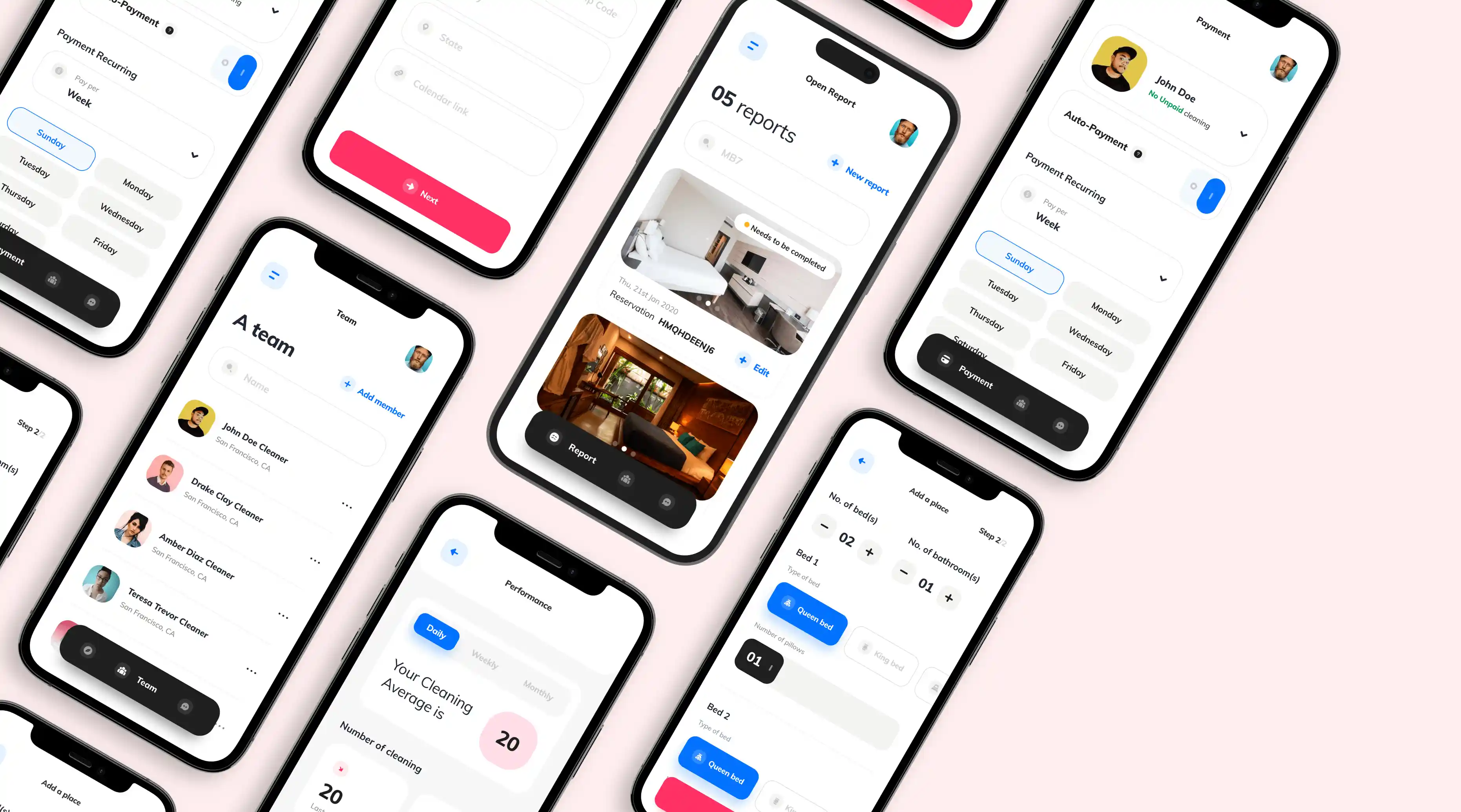
Creating an intuitive and easy employee management that helps track the overall team performance along with assigning tasks & checking of the current bookings made.
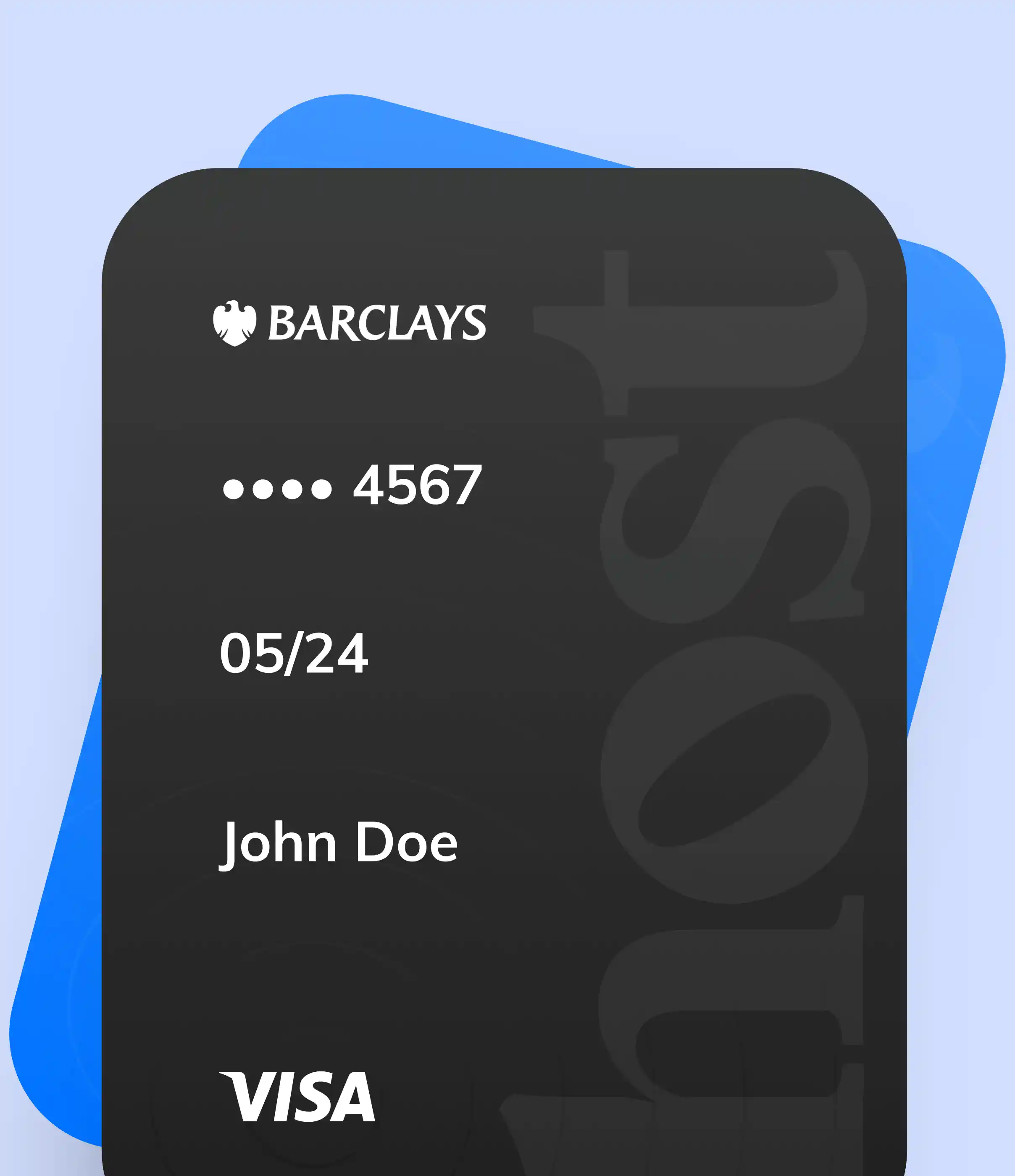
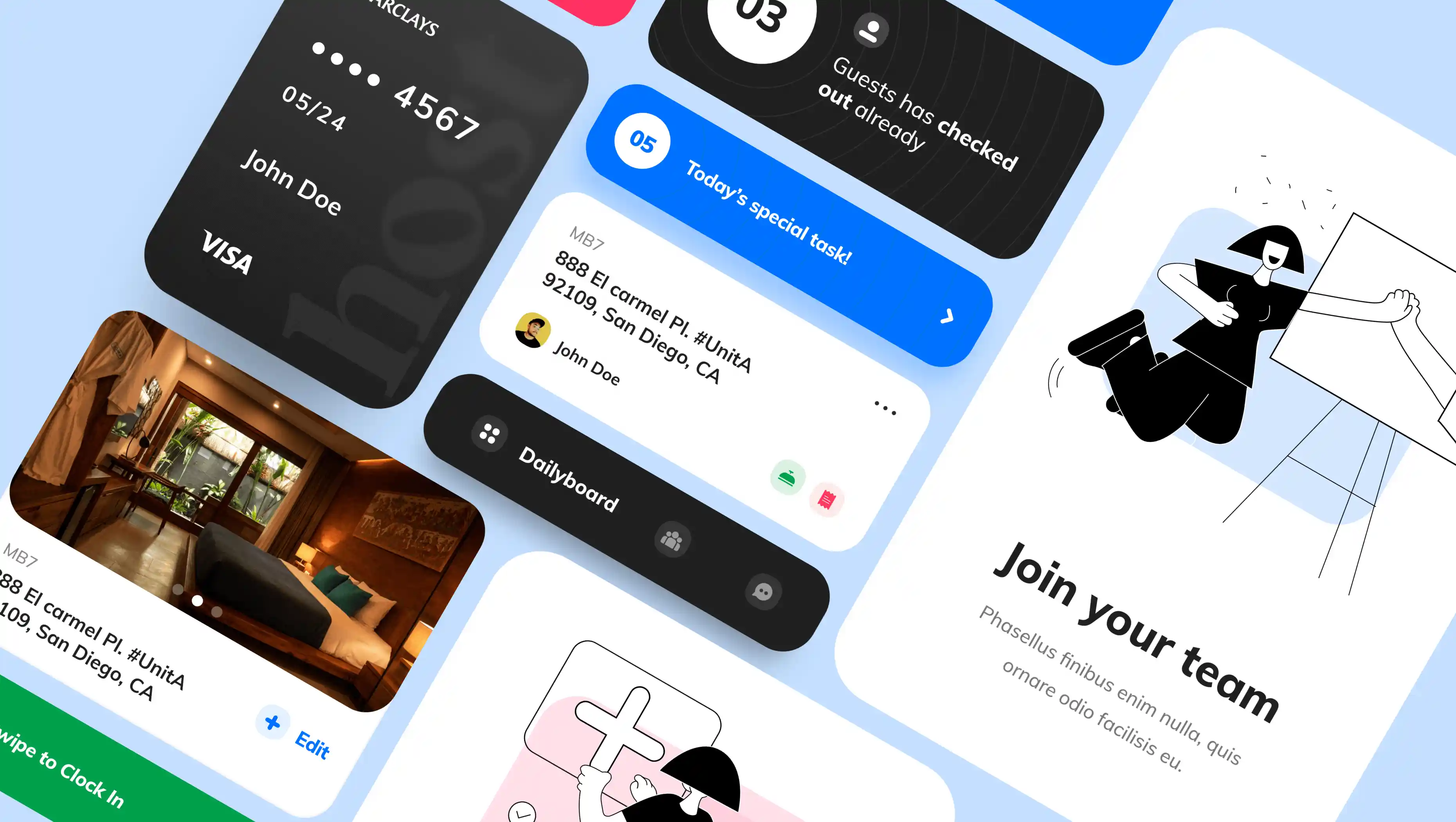
With Host coordinating and staying in touch with the team has never been easier. Personalizing their tasks, schedule and get daily employee report! We also worked on creating a hassle free payouts with auto-payment. We used a font that aligns with the brand's values, such as a modern and friendly typeface. The typography should be easily readable and complement the logo's design. The colour palette that reflects the brand's warm and welcoming & trustworthy personality. Soothing blues and pink, as mentioned in the brand's colour palette, can be integrated into the logo. The UI displays a wealth of information about bookings, team communications & performance, and property reports without overwhelming the users. Achieving the right balance between information density and a clean, uncluttered interface is challenging but the real need!
The app is all set to hit the market. Soon we can get to know the impact with the broad audience
Client
Project team

Branding, BFSI